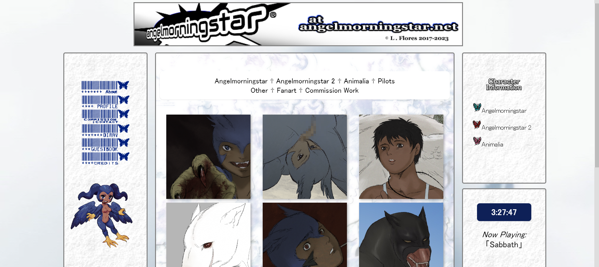
Entries
- 2.20.2024: Am I Good at Art?
- 12.2.2023: Website History
- 6.29.2023: Leucrocotta, To Devour a Human
- 6.11.2023: A Noble Girl
The Blog of Angelmorningstar & Dacrylagnia
This is my blog where I detail my thought process when making an illustration or creating a new character. You can also find my general thoughts on things.
If that sounds boring, that's because it probably is.
2.20.2024—Am I Good at Art?
I’m an artist, but I’ve never been good at it. This isn’t me being hard on myself – I just didn’t have the inclination or discipline from a young age that some others might possess. Some may call this inclination “talent”. While I was excellent in academics, it was the arts I cared about. It could very well be because it’s the one thing I actually had to try at. Save for math, which did require some effort, but not nearly as much as the arts. Nothing compared to it, not even technical drawing.
This could all be explained with the fact the things I described – math, technical drawing, academics as a whole – are “objective”, they can be acutely measured, as there is little matter of taste in them. There is no anxiety or uncertainty to be had. That is, unless you’re just bad at those things. But even in the badness there is certainty, as your badness is measurable, and there are concrete reasons for its existence. With art, there is significant anxiety, because while objectivity can be applied to it, it can be ultimately thrown out the window.
Now, one may be tempted to throw a wrench in my beliefs with “well, there are art classes and art schools…” which is true, but I would argue that these aren’t objective either, for the same reason that art in of itself is not objective. I think in specific of the YouTube user LavenderTowne who attended art school. I implore you to look her up. I do not personally find her art to be very good. Subjective, isn’t it? A school, somewhere in Canada, looked at her art and found it to be acceptable for a degree. Keep in mind I have nothing against this person; her greatest crime is that her art is not to my taste, which is fine. However, it’s difficult not to point out her portfolio is reminiscent of what you would find on a young teen’s Tumblr blog in the 2010s.
Obviously, I am not a part of any art school, nor am I a person that should be considered to have any credibility. This is where the uncertainty sets in. Am I wrong in finding this lacking? People with far more experience than me say it’s fine. So is my art fine? Is what I make worse than what this YouTuber makes?
It gets muddled further when you think of an artist I do like: deviantART user sharkplane77. The user draws, among other things, living airplanes (think of Planes, the spin-off of Pixar’s Cars), usually on paper and made with colored pencils to an obvious degree. Despite its unprofessional nature, I absolutely adore it. I genuinely think of this person as one of my favorite artists ever.
It’s hard to deny that sharkplane77 and LavenderTowne have more in common with each other than both of them do with what we’d consider a professional artist. Both have rudimentary art featuring a basic understanding of perspective and composition (just like me). Both are beloved by others as well. Sharkplane77 was surprised to learn they had gained a small cult following online. In the comments of a post they made acknowledging the newfound recognition, they replied to another user, in part:
“thats just my opinion though, but obviously the less technically skilled an artist is, the more likely they'll be made fun of no matter what it is they draw...while god-tier artists can draw cringy cookie-cutter junk and get great popularity just cuz it happens to look good >.<” (source)
Ignoring the accurate sentiment for another time, it appears sharkplane77 has ideas about the truths of “good” and “bad” art as well. Something can “look good” but be “junk”. Beauty isn’t everything in art, so even a good-looking piece of art can be bad. Art can look bad but be good. Art and the quality of it is, ultimately, about taste. The art of Pablo Picasso is both taught about in schools and written off as no better than a child’s chicken scratch. The rules can help you as a foundation for a piece, yet your willingness for the total disregard of them can be what makes or breaks your work.
I want to be good at art. I always have. But how can I ever tell when I am good? It’s immeasurable. I’ve had people mock it, I’ve had people admire it. So how? How can I possibly know? I’m an anxious person and I like certainty and nothing about this is certain. Sometimes I think I am good and I look back months later and think I am god awful. Sometimes I think I am god awful and look back months later and think I am good. It’s madness. Technical rules can’t be your Bible, as going against the doctrine can be the right thing to do at times. It can be paralyzing. In fact, it was; I didn’t draw for a few years in my pre-teens and teens. The paralysis was cured by its catalyst: the anxiety of, and the desire to be, good.
Nowadays, I think I’m alright at art, probably. I don’t have any numbers to prove it or any list of criteria to use when measuring, which is annoying, but it’s how I feel. I suppose that’s all art is, anyways. Even what counts as art can be contentious. Anti-art, a real thing that exists, is often described as artwork.
So, maybe I’ll never be good at art. I’ll let you know how it goes.
6.11.2023—A Noble Girl
Recently, I made a character design of a knight. It was my first real, true attempt at not only drawing armor but designing original armor. As to why I did both at once...well, I am a masochist, after all.
Thankfully, it is easier now than ever to find resources for all sorts of artistic endeavors. Going through tutorials and using photographs as references, I designed this fair lady:
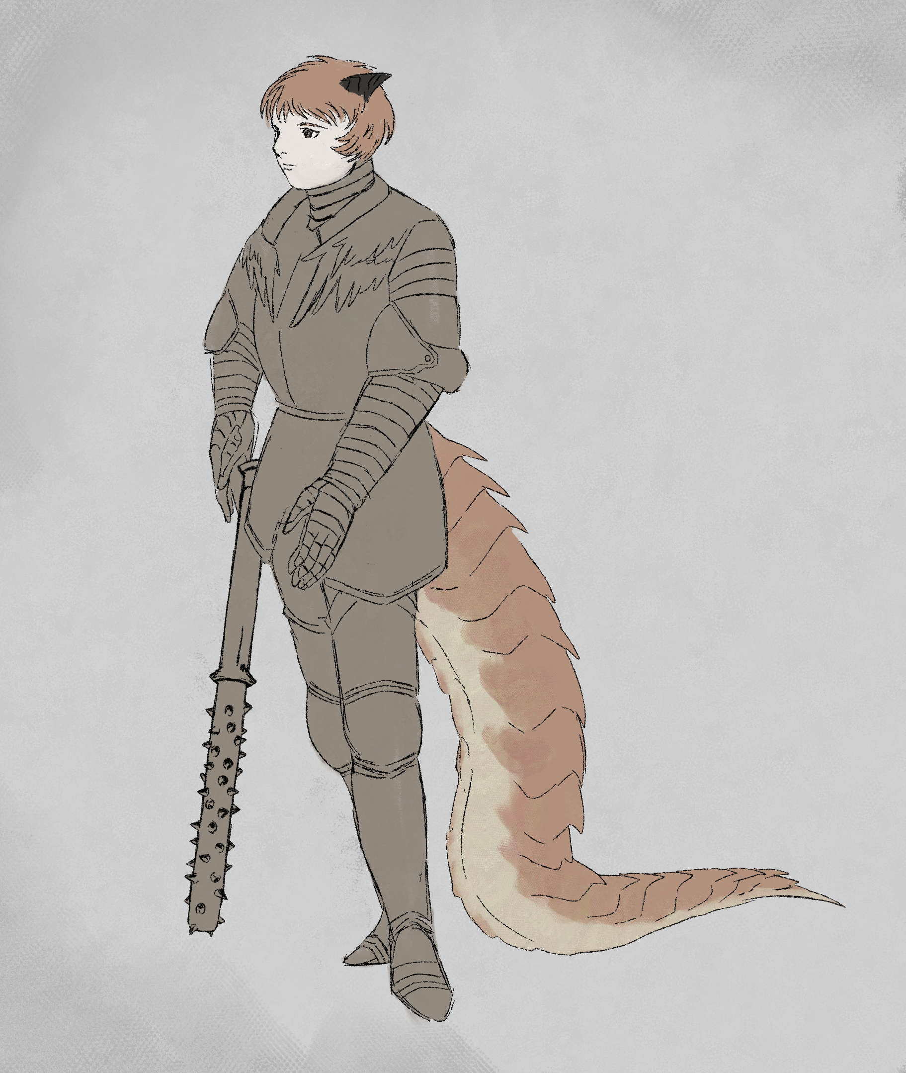
The poor girl has no name yet. I drew her based on an idea I had of a beast girl who wishes to be a kind, noble knight - however, due to her nature, she is plagued by fantasies of violence and assault. As to not frighten people, she takes the form of a human woman.
Since she rejects her nature, I did not use pointed ridges for her armor like the ridges on her body. The way a character dresses can say a lot about them, so I was mindful while designing this aspect.
At her core, she is brutal, so I gave her a weapon to signify that part of her. It's a silver spiked club; sort of like a morningstar, but without the ball. The inspiration came from this picture:
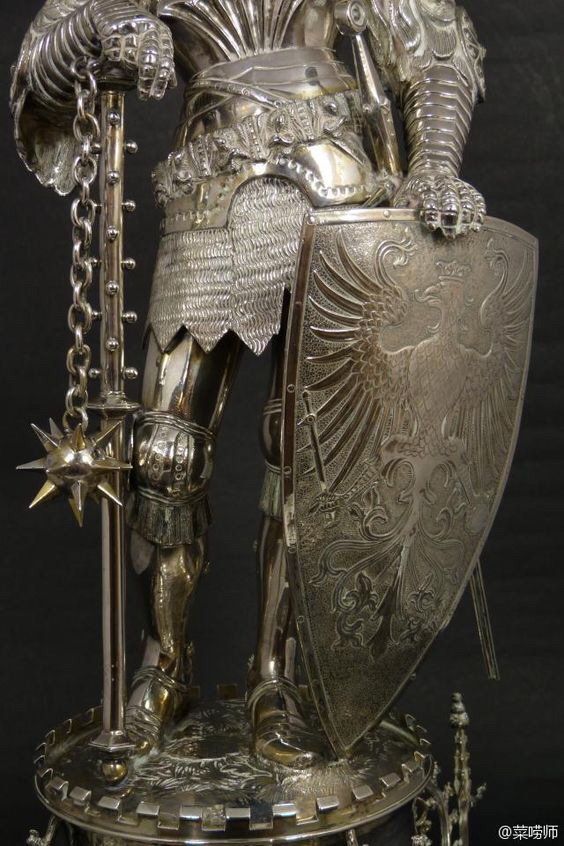
I thought what if the weapon was just the handle part? and went from there. Sometimes inspiration is what you personally see in something, and not the actual intended vision. As Maung Thuta said: "A statue doesn't have to be inspired by a statue." (source)
Overall, my biggest mistake with the design is that I did not consider what her real form would look like while making it...
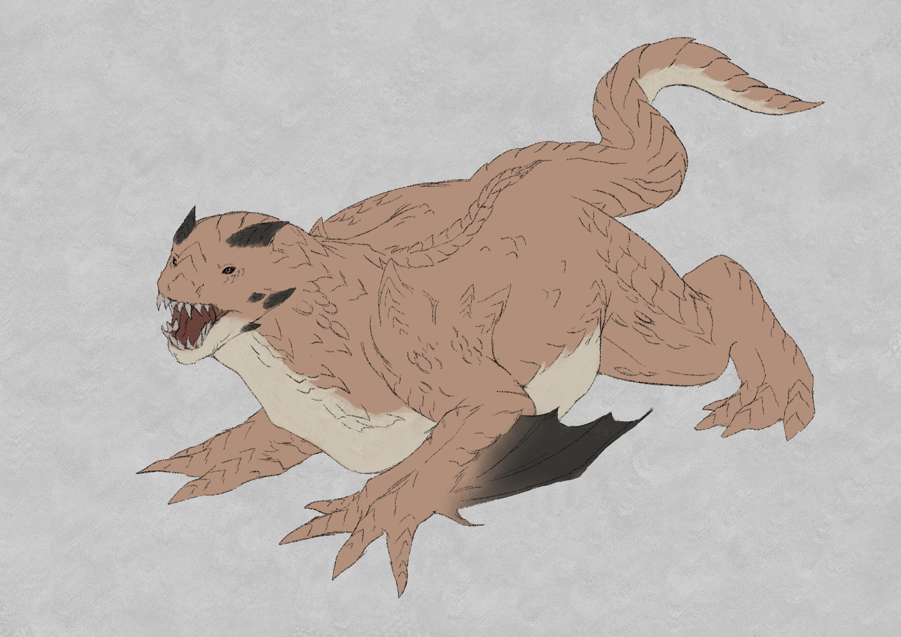
Nonetheless, I gave it my best shot. I gave her true form a lot of pointed ridges, black horns, and very small wings. She's supposed to be a wyrm. In her world, wyrms are seen as the less graceful, less respected version of dragon.
To be frank, I am still not very great at drawing dragons or dragon-like creatures. All the detail makes me go a little crazy. I think my prior practice helped a lot here. I could still do a lot better, but that will come with time.
I don't plan to have this woman as my main character. Actually...I have not even thought of the main character yet (ーー;) But I'll think of something! I think it is important to have likeable/interesting characters, even if they're just side characters. Something I love about 【Dark Souls】 is how there are so many eccentric, interesting characters, and you can really become fixated on any of them. I hope to bring out that kind of fascination in people with my own creations.
Until next time! ★
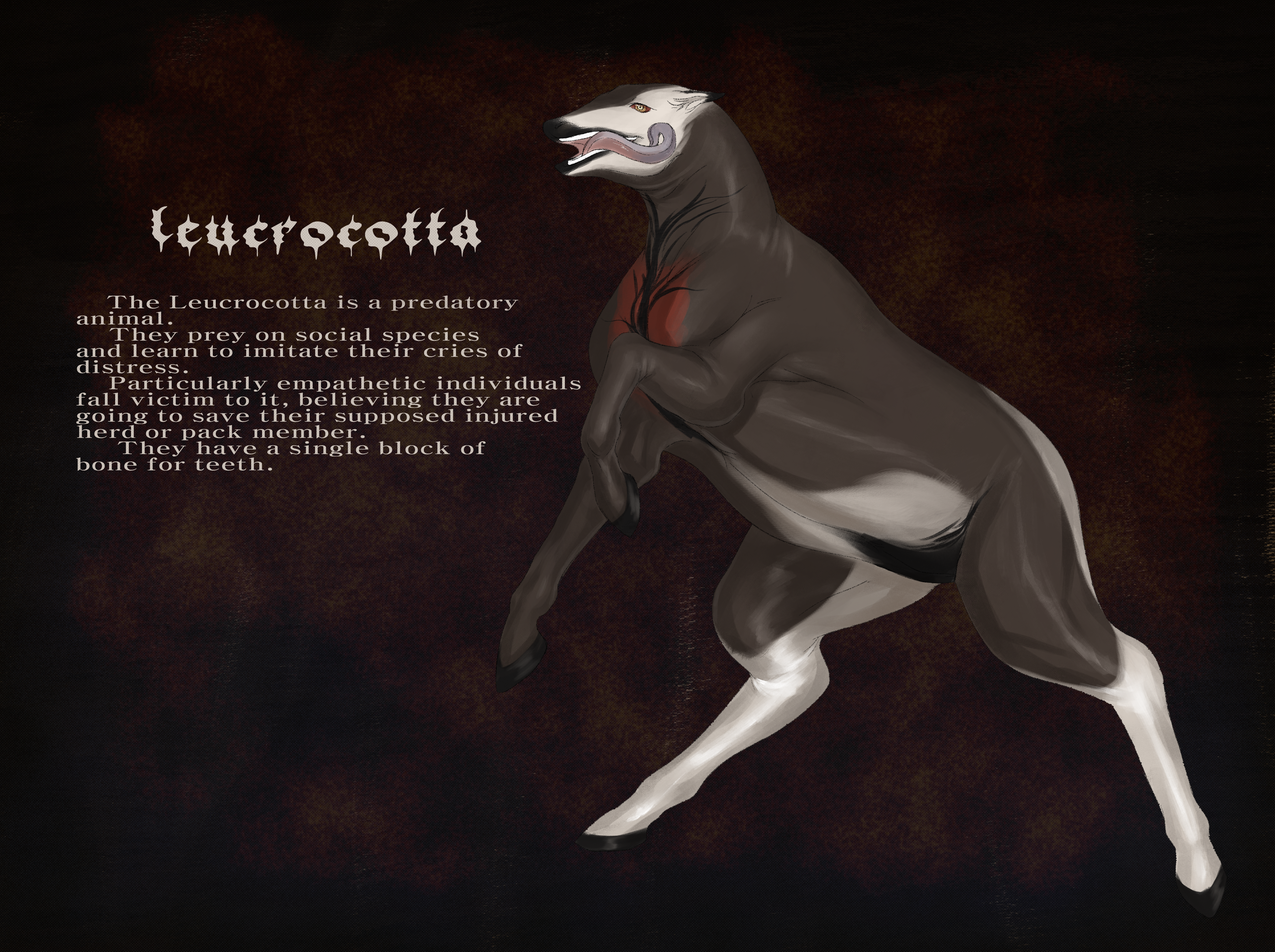
6.29.2023—Leucrocotta, To Devour a Human
I've designed a leucrocotta (also known by nigh endless variations of the words "crocotta" and "leucrocotta") as a part of my medieval-based world. I picked this as it came up during a conversation I had with David, where - among other creatures - the leucrocotta was mentioned.
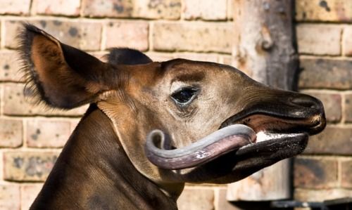
For the appearance, I was inspired by a few things, one of which was this photograph I saw on Pinterest.
 (source)
It's of an okapi, which have particularly long, black tongues. I ended up basing the leucrocotta's appearance pretty heavily on an okapi. Unlike an okapi, however, the leucrocotta does not feature stripes, large ears, or very thin legs.
For the sclera, I chose red as it is very striking. It is also reminiscent of one my favorite animals, the bearded vulture. Evolution-wise, they supposedly have these as a threat display. For my leucrocotta design, they just have them because I thought it looked cool.
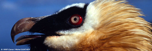 source: Michel Gunther
I also chose to use red on the chest as it is supposed to resemble how male geladas flaunt the red flesh on their chests to attract a mate. I already used this idea for the ghouls in Angelmorningstar, so I dialed it back a little and just had the red be a splotch of color on the chest area. Perhaps female leucrocotta don't possess this marking...
I considered making the ass blue, but I wanted to avoid too much color and distraction within the design. No blue ass for you, leuleu.
As for the traits of the leucrocotta, I based it on actual descriptions of the beast, especially Pliny's from 【Natural History】:
"When crossed with this race of animals the Ethiopian lioness gives birth to the corocotta, that mimics the voices of men and cattle in a similar way. It has an unbroken ridge of bone in each jaw, forming a continuous tooth without any gum."
and
"In Ethiopia there is an animal called crocottas, vulgarly kynolykos [dog-wolf], of amazing strength. It is said to imitate the human voice, to call men by name at night, and to devour those who approach it."
This, to me, is absolutely fucking terrifying. And because I'm just like this, I decided to crank it up even further: my leucrocotta is a creature which preys on the heroic and empathetic of this world. The people who wish to save & help others are the ones who fall victim to it.
You may notice that in both written descriptions and visual representations of the leucrocotta, it is most popularly represented to be canine-like in some way, possibly because the creature these people were describing was what we now call a hyena. However, I think visually and conceptually this depiction is incredibly boring, nevermind how accurate it is. Ultimately, the biggest source of inspiration for my design was from the amazing person behind 【A Book of Creatures】.
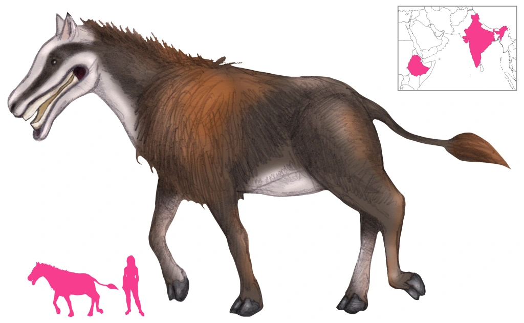 (source)
I am obsessed, OBSESSED with creatures that resemble peaceful herbivores and should otherwise be peaceful herbivores, but are actually violent and cruel. Bonus points if the creature is also a carnivore. You can see this within the design of the unicorns in Angelmorningstar, which feature lion-esque front legs.
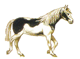
I am not sure I will ever get tired of this concept. I think my initial fascination of it came from the classic possessed horse scene with Farnese in chapter 124 of 【Berserk】 where the trusty steed of Farnese suddenly becomes possessed and attempts to rape her.
For today, that's all I have. Currently I am working on an illustration featuring the leucrocotta and Cateline, our noble knight. I hope to see you next time! ★
12.2.2023—Website History
I know I tend to switch between sporadically updating my site, with updates being actual months apart, to updating it almost daily. As I said in part of my QnA, this is because I am very fickle – though this appears to be a trait I share with other Neocities users, as some make an entirely new layout from scratch every 3 months.
My layout, however, has only entirely changed once or twice. The earliest snapshot on the Wayback Machine shows that on February 4th, 2021, a little over a month after its conception, my website looked like this:
 (source)
Basic. Embarrassingly basic, even. Worse than a Carrd, even. ○| ̄|_
But this was the equivalent of dipping my toes into the waters of HTML & CSS. Many people new to Neocities (the hosting service I use) start themselves off with a template they found online. I did not, and I can’t recall if that was because I didn’t know there were templates or if I was too stubborn to have the layout of my website be something someone else made.
This version of my website, version 1.0, lasted until February 25th, 2022. Unfortunately, after this point it is difficult to get another accurate snapshot. They exist, but they look, uh…
 (source)
I’m not sure why this is. I promise you I did not bork my website this hard. The thing you’re seeing so prominently is a custom navigation bar that stuck to the left side of the page. It is a little sad to me that version 2 of my website is essentially lost, even if it’s likely poorly designed.
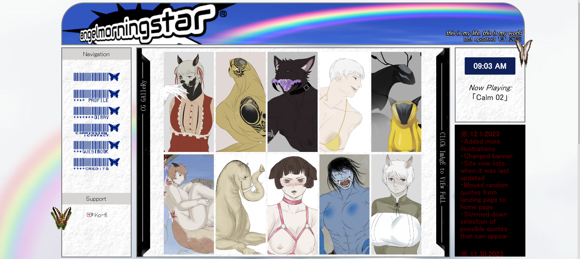
Regardless, the next earliest snapshot that isn’t broken was taken on June 8th, 2023:
 (source)
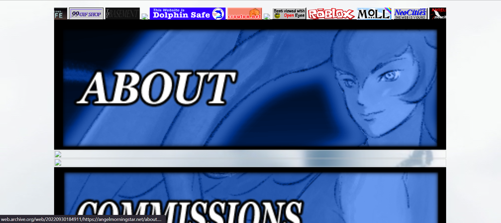
Version 3 isn’t too far off from what I have currently. One of the major philosophies behind the design for my website is that the art must be accessible without clicking anything. It isn’t hidden on a separate page, you don’t have to click an arrow to expand a little box, it is right there upon entering the home page.
There is one big problem I have with this version of my website and that is the category box. I tried several different ways to get it to look less unsightly, but it always took up so much space and I am not certain if anyone appreciated it. It made finding all of my art a chore consisting of multiple clicks which is even worse than what I was trying to avoid. I kept this little box for way, way too long.
The other problem is the segment for character information. Every page was either nonexistent or horribly incomplete. I am never going to finish ALL of those pages, so they have been removed in their entirety and will remain that way indefinitely.
And now, we can reach current time, with
version 4.0 of my website. As of December 2nd, 2023, here is my website:
 (source)
It is the cleanest, most readable, and least incomplete version of my website thus far. There are no dead links or links to horrifically incomplete pages. The most important information is at the top of the page, while things people likely care less about are at the bottom. There are probably ways I can make everything more accessible. For instance, I think I could do with some kind of image hover effect on the gallery to give more indication to the viewer that they are supposed to click the previews to view the full image.
I’d also like to find more music to add to the home page. I’ve added and removed several tracks by now, as I am picky with what plays. It must be gentle and non-offensive to the ears. This isn’t because I hate hard music; I actually prefer it over something like a piano track. I just inexplicably feel it’s the most appropriate. It could be that it’s not too distracting from the art being presented. It also won’t turn people away. As much as I love loud music, it can be jarring and annoying coming from a website, especially when there’s no audio controls. This is fine if your vibe or purpose is being jarring and annoying, but that’s not my goal with this website.
Actually, speaking of which, I don’t know what my goal with this website is. Maybe it’s to be more like the artists I enjoy. They tend to have their own websites, like Patricia Piccinini, or Daniel Drabek or Paul Komoda. Or maybe it’s to have a place besides vapid, hostile social media to contain my art. I have a tendency to forget to put content warnings on things, and it isn't because I think they're a sign of oversensitivity, but because I am not phased or offended by most things and I genuinely forget that other people are. I'm not very sure what will make people happy if good intentions aren't enough.
Of course, being mostly located on a personal website doesn't make it impossible for me or you to receive hate. People will go out of their way to make sure you know they don't like you. I will say this, however: putting hate on mine or anyone else's guestbook is not a good idea (。・∀・)
Another problem I've run into is being put in situations where my art either A) isn't allowed to be posted in a certain place or B) can be posted, but must be categorized as pornography. I have nothing against pornography; I make erotica and porn myself. What irritates me, however, is having to treat my own piece as porn simply because there's a naked woman in it. Of all the things are sensitive about, artistic nudity is the one I understand the least... Is it artistic nudity when the subject is unattractive, and pornography when the subject is beautiful? Regardless, having my own website means I can put anything anywhere and there is practically no pressure to put labels on my hard work.
Perhaps, though, I made this website because I like things with an older aesthetic and I hate to see that style disappear. It's been compared to "old web" or "web 1.0", which wasn't an entirely conscious decision. I like old websites but didn't realize there were terms for that sort of thing.
Compared to others, my site is very primitive and simple. To me, it’s everything I need. I would like to continue expanding upon it until, at the bottom of my home page, the word “present” here is replaced with a number.